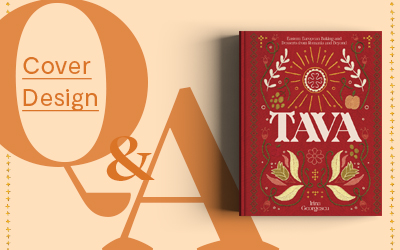
Cover Design Q&A: Tava
|
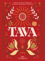
Just like all the recipes inside, there's a fascinating story behind Tava's beautifully unique cover. For this month's Cover Design Q&A we spoke to the wonderful Kait Polkinghorne, who took us behind the scenes on the design process and how she blended embroidery and illustration into her work. With Eastern European iconography and hand embroidered details, there's so much to explore with this cover - read on to find out more! You can see examples of Kait's work on her Instagram.
Tell us about yourself.
Hello! I am Kait Polkinghorne, a designer and illustrator at Evi.O-Studio. I have been working with the Evi.O-Studio team for over three years, making books and bits and bobs from our studio in Marrickville, Sydney. Founded by Evi O. - a giant in the book design world - we are now a team of six, creating over fifty books a year.
What was the brief?
The brief was to create a book that celebrates Romanian home cooking and tells the story of Romania and its surrounding countries. Irina felt very strongly about exploring the world through food and understanding people through what they eat.
Three words that stood out to me in the brief were ‘beauty, inspiration and intrigue’. I wanted to tap into the idea of intrigue in particular for the cover - when people pick up Tava I want them to question how the book was created. Blurring the lines between embroidery, illustration and photography.
For the internal design, warm tints, expressive typefaces and crafted page elements were how I tried to weave beauty and inspiration into each page. These features do their best to compliment the romance and texture of Matt Russell’s beautiful photography.
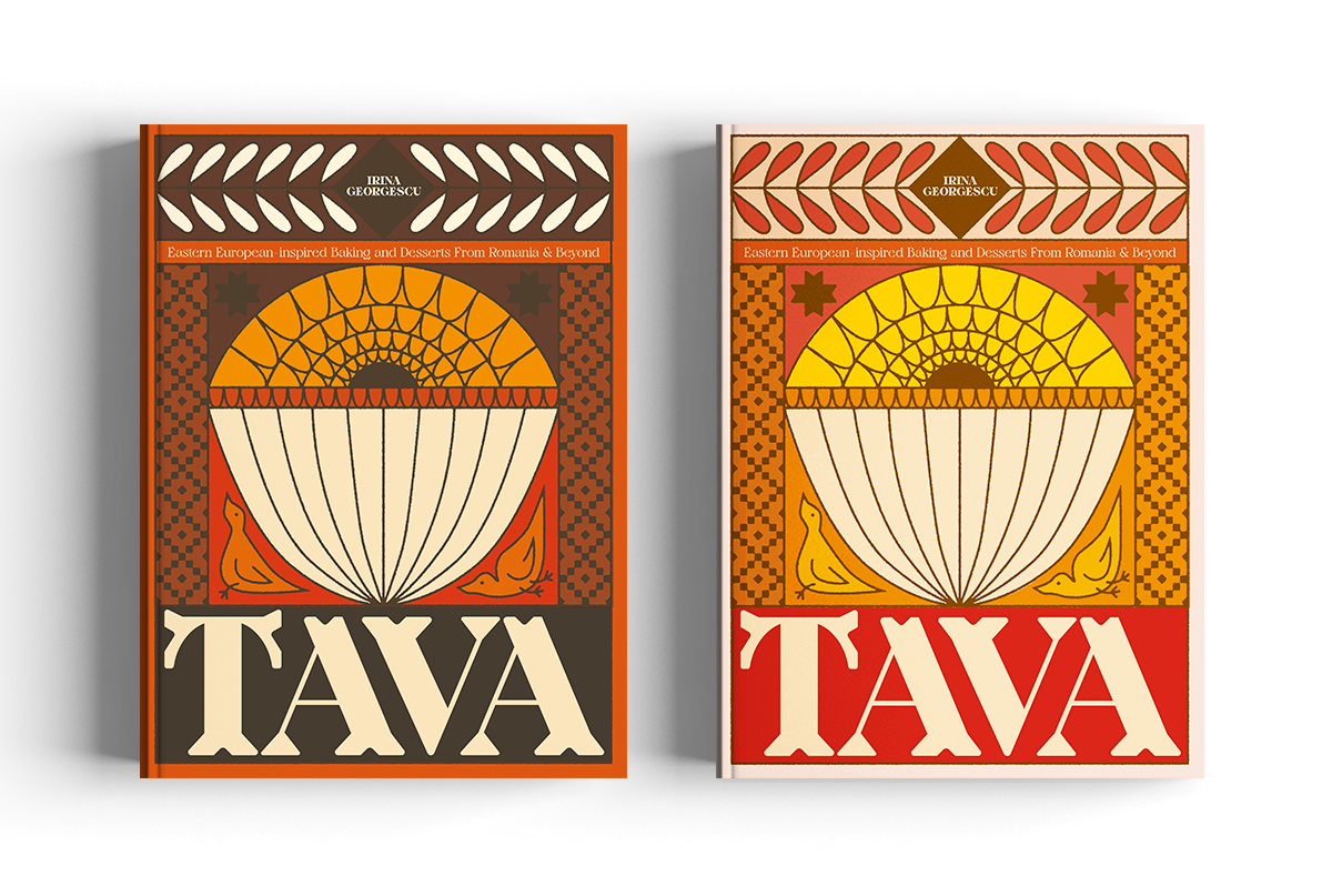
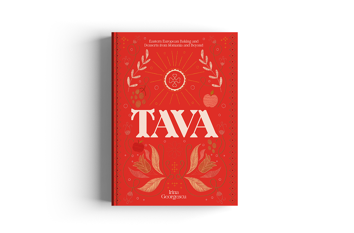
From the beginning there were two options that were the winners in our books. Both rooted in the cultural craft of the region, a textile led direction and a woodblock printed direction. Both had their strengths, but the embroidery concept took the cake in the end.
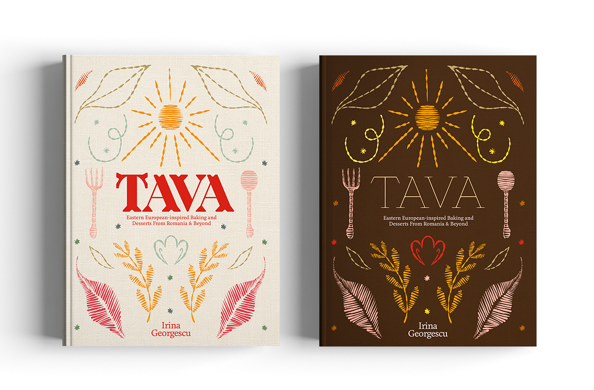
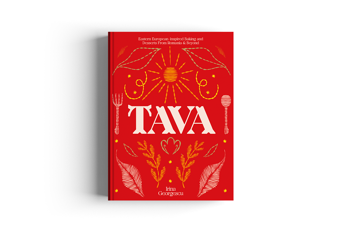
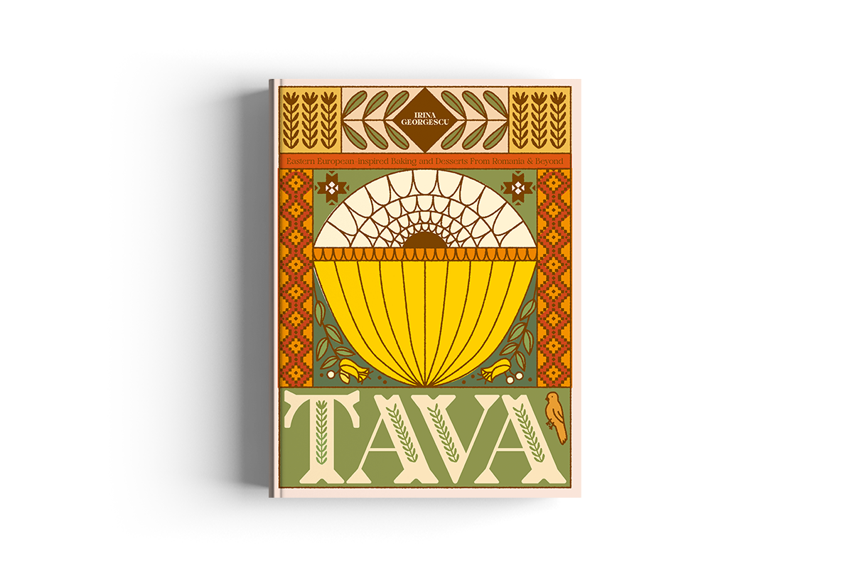
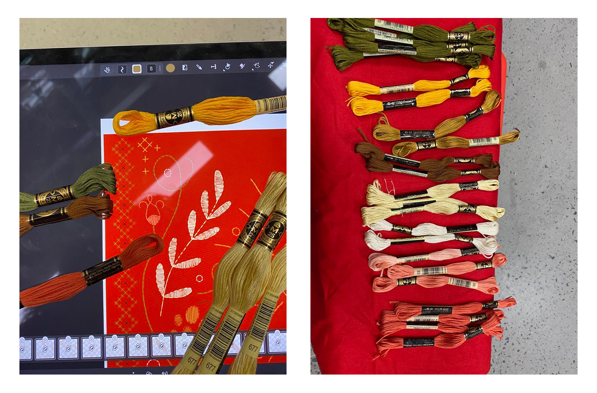
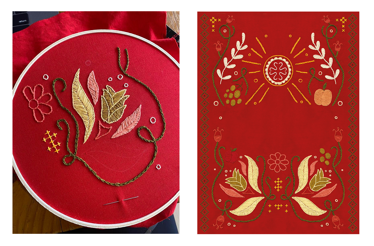
It was important to us to consult closely with Irina to embed traditional motifs into the design in a considered way. The initial iteration of cover directions were primarily an expression of typography, colour and composition. Over the next few developments we wove Eastern European iconography into the design. For example, the fruit and flowers on the cover were each selected by Irina to reflect important flavours and motifs with cultural significance. Once the final composition was approved and sketched out I started embroidering! From comparing 100 different colours of red cloth to deciding on each thread colour - the whole process was an incredible way to combine on-screen design and handcraft.
How long have you been doing embroidery and how did you first get into the craft? If you were to go back in time, would you still opt to hand stitch the artwork for the cover and chapter openers?
I studied both Graphic Design and Textiles at university, so I have tried quite a few hand sewing and weaving techniques - I always consider the physicality of what I am designing and try to bring in handcrafted elements into my work as much as possible.
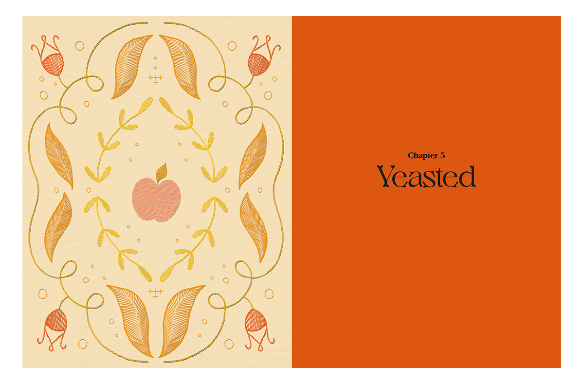
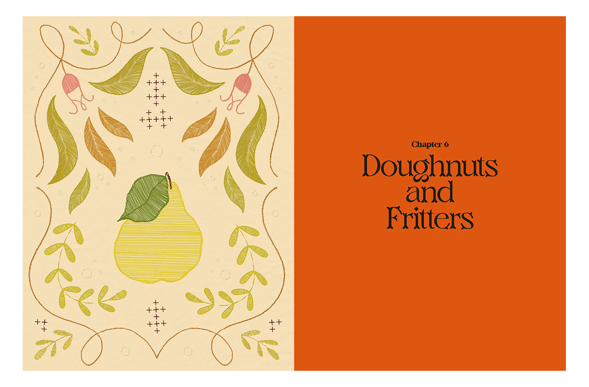
I absolutely would still go back and embroider the cover. I am always up for a challenge so, although it was indeed a labour of love, when I saw the book for the first time it was all worth it. A sneaky aside, the chapter openers are actually illustrated! If I had hand embroidered all the chapter openers I might have had a different answer.
Jager, the typeface you used on the cover, is such a special one and fits so well with the subject matter of the book. Could you talk us through your process of discovering new typefaces and deciding which ones to use in your work?
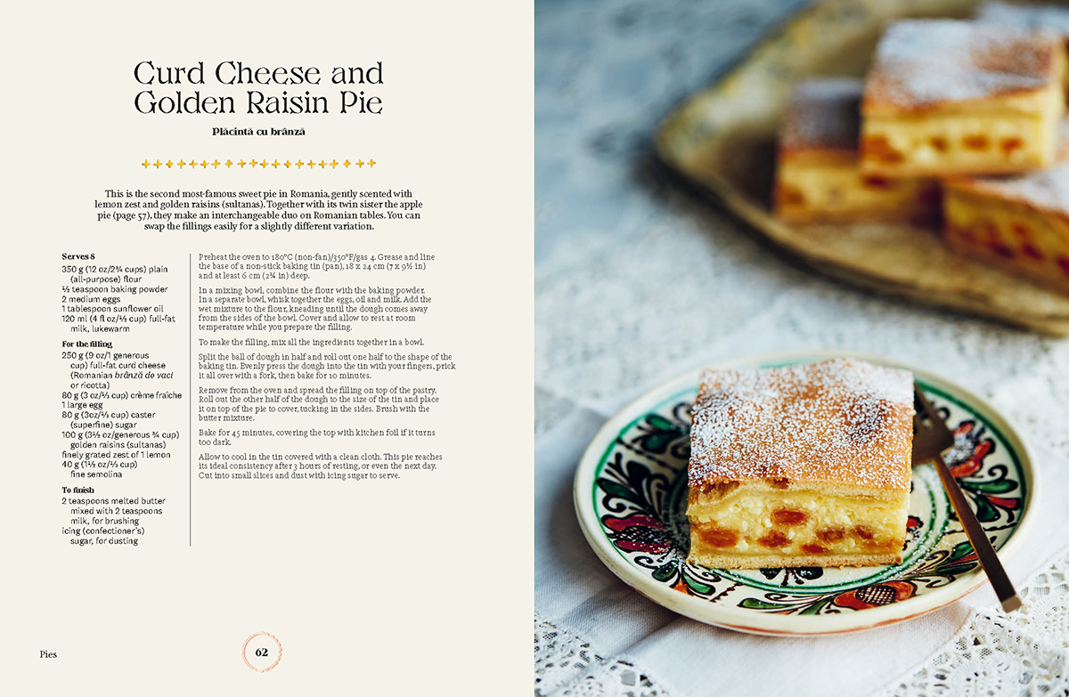
I had seen Jager on the VJ Type website when it first came out whilst looking for typefaces for another project, this is often the case in looking for fonts, finding real gems while searching for something entirely different. I was so excited to have the chance to use Jager. I can’t imagine a more perfect typeface for this cover, one that had the detail of the serifs with the boldness to stand out in the complexity of the design. (Below: Jager typeface used on recipe name Curd Cheese and Golden Raisin Pie from book)
Do you have other crafty hobbies?
Spending so much time behind a computer screen, I try and balance screen time and creating things with my hands. It exercises another part of my brain and I find it really informs my design practice. Embroidery, knitting, crochet, painting and drawing. Ceramics is my true love after illustration, if anyone is selling a second hand pottery wheel - let me know!
What are your plans for the festive season?
Luckily for us in the Studio, Sydney Christmas is in the heart of Summer - my plans are swimming in the ocean, eating oysters and catching up on all the reading I have put off this year.
Tava by Irina Georgescu is out now, available from local bookshops, Waterstones and Amazon.
Read our previous Cover Design Q&As!
Oren with Stuart Hardie | From Scratch series with Lucia Vinti | Fire Feasts with Emily Lapworth | Advent with Emily Lapworth | The Italian Deli with Katherine Keeble | Crave with Claire Rochford | Sea and Shore with Nikki Ellis | La Vita è Dolce with Susan Le | Bowls and Broths with Han Valentine | The Nordic Baker with Gemma Hayden